Client: Norwood Development Group
Role: Design + Direction
Type: Brand Identity
I was the creative lead, uncovering the brand strategy: personality, identity, key characteristics, probable target markets, and the guiding principles of the brand. I also was the sole designer for visual brand identity and website user interface.
The entire process was thorough and collaborative with numerous C-Suite stakeholders that I worked with. But establishing this brand foundation was key to ensuring that the brand identity was expressed not just through visual means, but resident experience as well. The Resident Experience team was then able to take the brand foundations and implement them in their own unique ways.
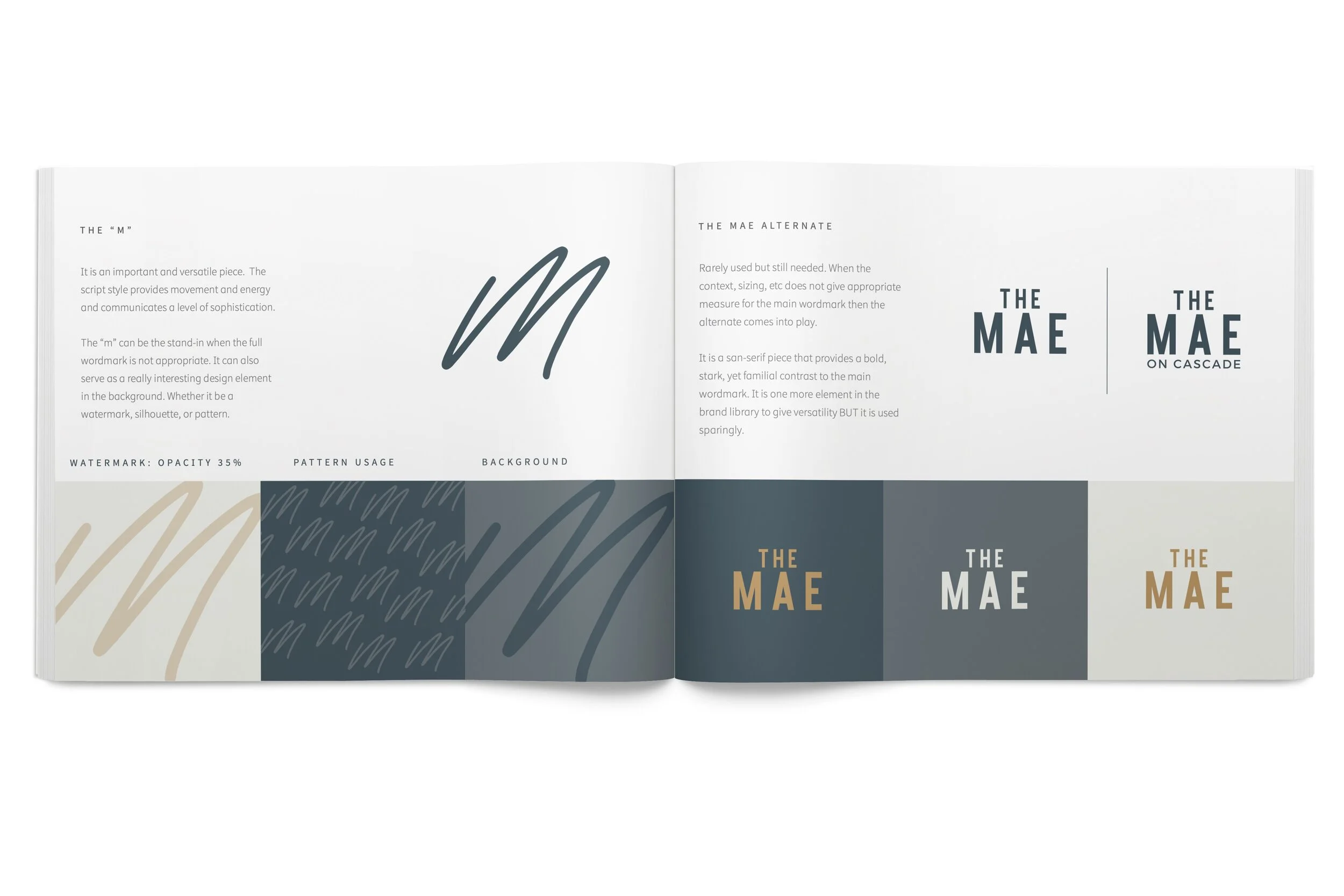
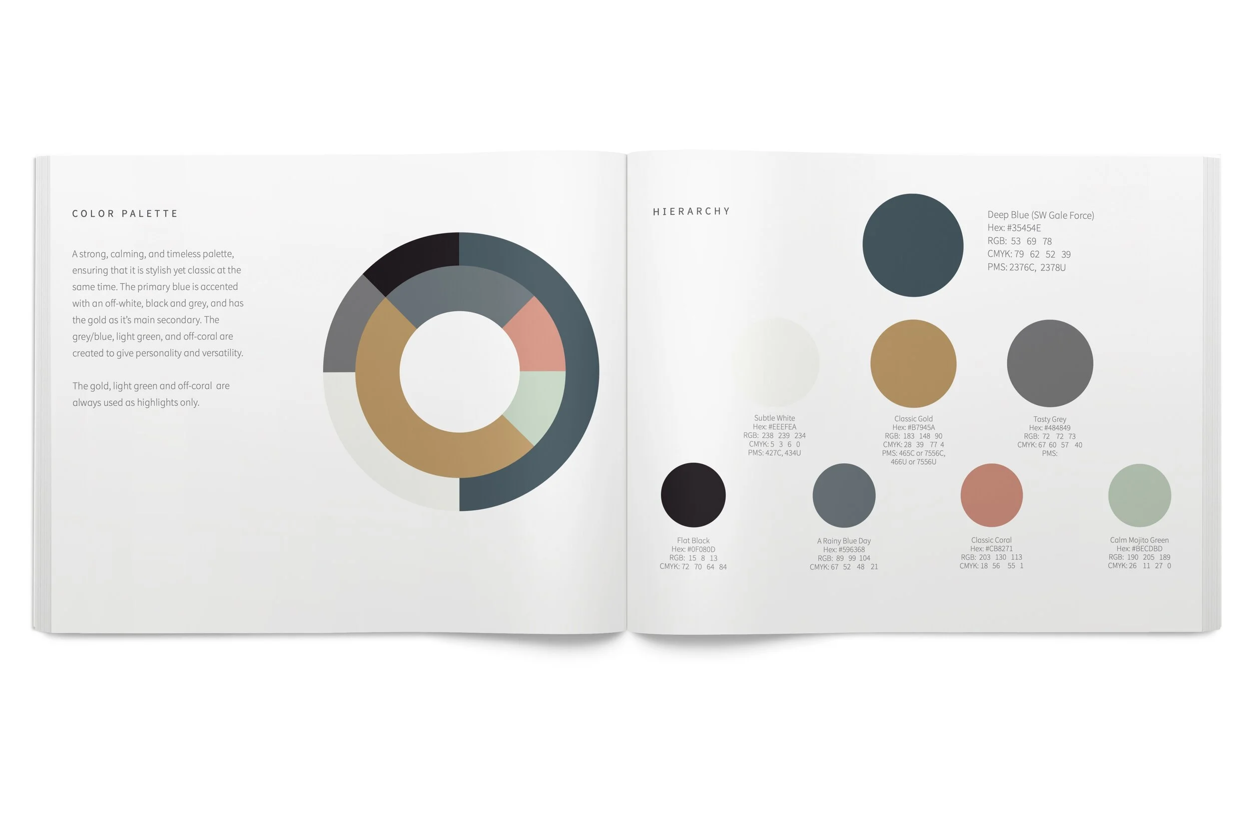
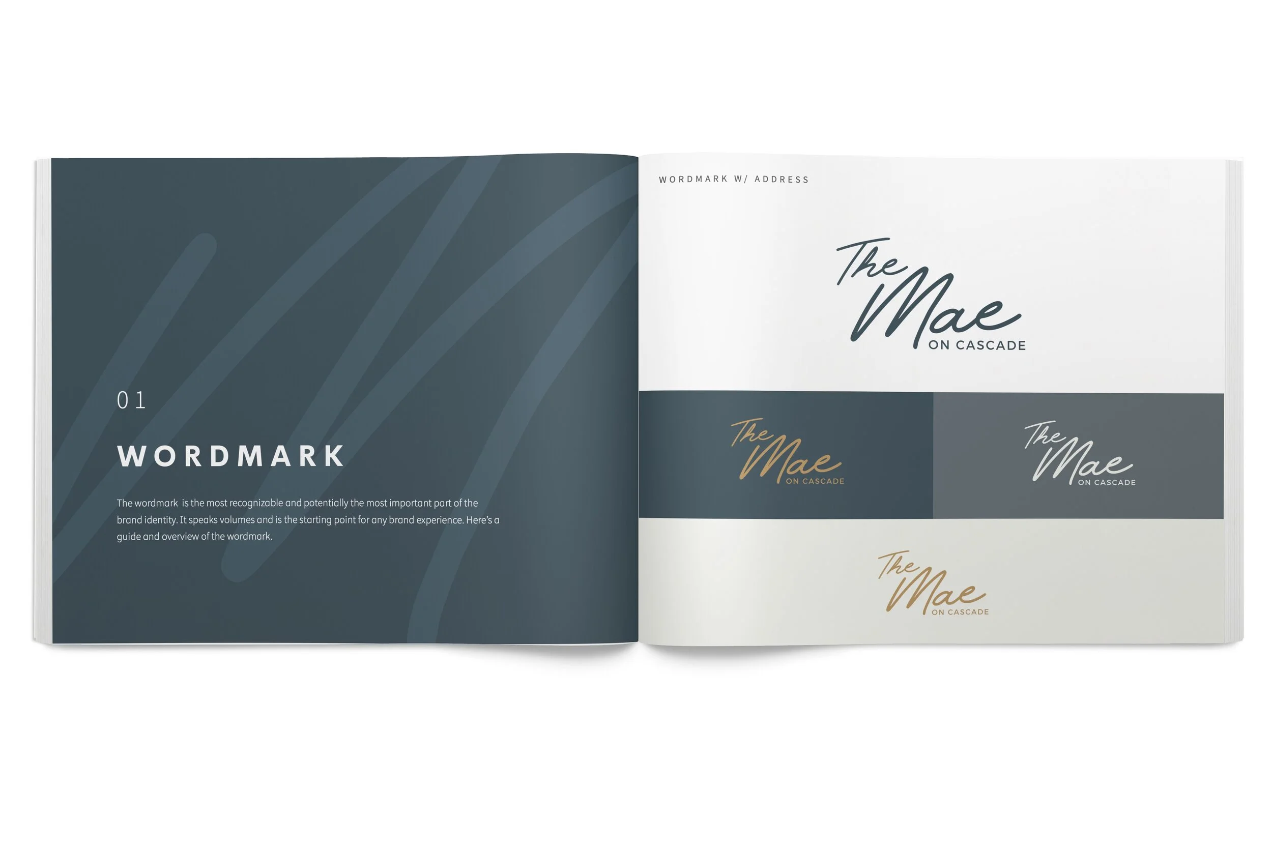
The logotype design utilized a signature typeface as the base and then was tweaked to fit the brand. The “M” very naturally became a brand mark to be used across visual touch points. Other visual assets were inspired by jazz music and use simple lines to evoke movement and energy. In terms of colors, I aimed to use a palette that was relevant and timeless. Colors that were calming, elegant, and unique.
The building (Opening Late 2020) will have a highly elevated resident experience, superb finishes, and great amenities (like a killer view of Pikes Peak). The brand’s visual identity and experience needed to reflect that elevated nature, so I created the mood-board to ensure the team was on the same page as to what “luxury” looked and felt like.
Not shown here: I led the development 4 key brand pillars that guided all brand and experience decisions, brand vision, and brand mission. It was important to solidify the brand narrative and identity so the experience would be consistent at each touchpoint.
The Mae’s website needed to serve a high-end clientele and thus the experience and visual design needed to give the feeling of luxury at every movement and click. It also needed to function as the core sales avenue because the building will not be completed until Late 2020. The site is editorial and narratival in nature, inviting the user into the property and giving a taste of the incredible experience of living at The Mae. Utilizing a visual framework that lent itself to interaction design was key, so I incorporated a high amount of imagery and subtle design elements. The site also needed to be really simple to navigate, as the typical user would be 65+ and also on mobile. Taking a usability stance from the beginning was important to the strategy, structure, and overall design.
*all images are placeholders as the property is not built yet


